Introduction to QGIS: Geomorphic Process Domains and Soils
Learning Goals
- Become familiar with QGIS, a free and open source GIS
- Install a QGIS plug-in to incorporate commercially-available (but viewable for free) imagery in a geospatial framework
- Import a
*.bil– an old but common binary data format for a geospatially-registered raster data file – into QGIS - Create and edit a GeoPackage layer
- Identify hillslope and fluvial geomorphic process domains based on topography
- Think through where you may find different soils
- Present your arguments and reasoning in writing
- Well-reasoned arguments lead to a good grade, even if you are wrong!
- Grammar, spelling, punctuation, and style may all be graded. Professional writing skills are essential and must be practiced. (Fancy is not necessary, but correct is.)
Deliverables: 60 points total
- (10 points) An exported map showing a DEM imported into QGIS, set up with a semi-transparent elevation color ramp over a shaded-relief map. Include a scale. Use the Print Layout tool to produce this. (See Step 7.)
- (10 points) This same map, but with overhead imagery (using HCMGIS) replacing the colored elevation data set.
- (25 points) This same map once more, but this time with the semi-transparent colored DEM replaced by semi-transparent GIS vector layers delineating hillslope vs. channel process domains in a subset of this landscape. Additionally, include an explanation of how you chose different process domains, as described in Step 11, below.
- (15 points) Identify graphically and in words the locations on the landscape in which you expect to find the shallowest and deepest soils, as well as the youngest and oldest soils. Here, it is your reasoning that counts! Think back to soil-production functions and think about what factors may cause hillslope material to erode quickly or to stay in place for a long time. See Step 12 for more information on this.
You are expected to hand in a single PDF document that is responsive to the above three bullet points, including both the maps and the text. There are many tools that you may use to stich PDFs together (web searches are your friend).
Steps
1. Download QGIS
Mac, Windows: https://qgis.org/en/site/forusers/download.html
Ubuntu Linux:
sudo apt install qgis qgis-dev
2. Download and unzip the DEM
Note that this ZIP archive has many files in it! Each contains some data or metatadata, such as binary values that combine to give topographic information or geospatial referencing information.
If you like: check out http://arcgis.dnr.state.mn.us/maps/mntopo/ to see where it came from. MnTopo is a great portal for high-resolution topography from across the state of Minnesota.
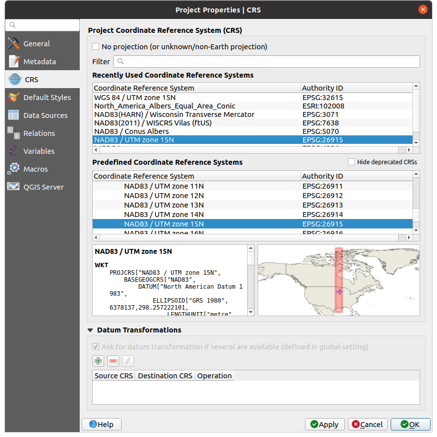
3. Open QGIS and set the projection
- Start QGIS.
- Start a new project.
- Click on “Project → Properties” to set the Coordinate Reference System (AKA map projection AKA CRS) for the project. For this lab, we will use UTM Zone 15N, as it encompasses this region of southwestern Minnesota.
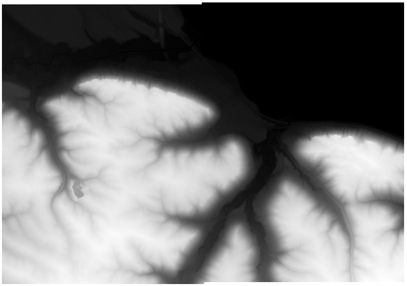
4. Import the DEM
- Click on “Open Data Source Manager”

- Select “Raster”, and for the source, navigate to the
*.bilfile that you just extracted. Click “Add”.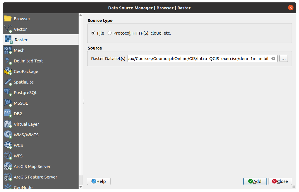
- You should now have a grayscale map on your screen that looks like this:
5. Add a little color to the DEM
Double-click on “dem_3m_m” in the “Layers” panel.
The window that appears has all of the layer information. It will default to “information”. This gives the size of the raster layer, its projection information, and so forth. If you are interested, take a look at the map projection.
Click symbology → singleband pseudocolor
Set the color ramp. the following instructions are just a suggestion – you may use whatever you like!
- Under “color ramp”, click “create new color ramp”
- From the next dialog, select “Catalog: cpt-city”
- Select “Topography”
- Choose one that you like. I use “Wiki Schwarzwald” in these notes.
- Click “OK” (maybe twice)
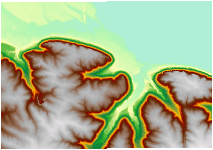
Note: if you are really into the cognitive science behind color maps, as well as colorblind-friendliness, you should take a look at Scientific Colour Maps.
6. Create a hilshade map.
- Right-click on the DEM in the Layers palette, and click “Duplicate Layer”
- Rename the copied layer to “Hillshade” via the right-click menu.
- While you’re at it, rename the original DEM to “DEM”
- Double-click on the hillshade map, and choose its render type as “hillshade” in the “Symbology” of the Layer Properties dialog. Keep the defaults and click “OK”.
Note: this method of generating a hillshade “on the fly” may make it look blocky when zooming in. Raster → Analysis → Hillshade will give you a way to create a brand-new file for the hillshade that sidesteps these issues.
7. Overlay a semi-transparent colored DEM atop the hillshade
With the new “Hillshade” map below the “DEM” in the layers palette (so it disappears beneath it), double-click on the DEM. Using the “transparency” tab, set a transparency that lets you see some detail of the hillshade alongside the transparent DEM.
8. If you have not done so yet, save your project.
For real! Save it!
9. Build a presentable map
Click Project → New Print Layout. Using the “Add a new map to the layout” button,  , create a map canvas area. Play around with the tools to position your map on the page as you like.
Then, add a scale bar using the proper tool.
Finally, export a PDF.
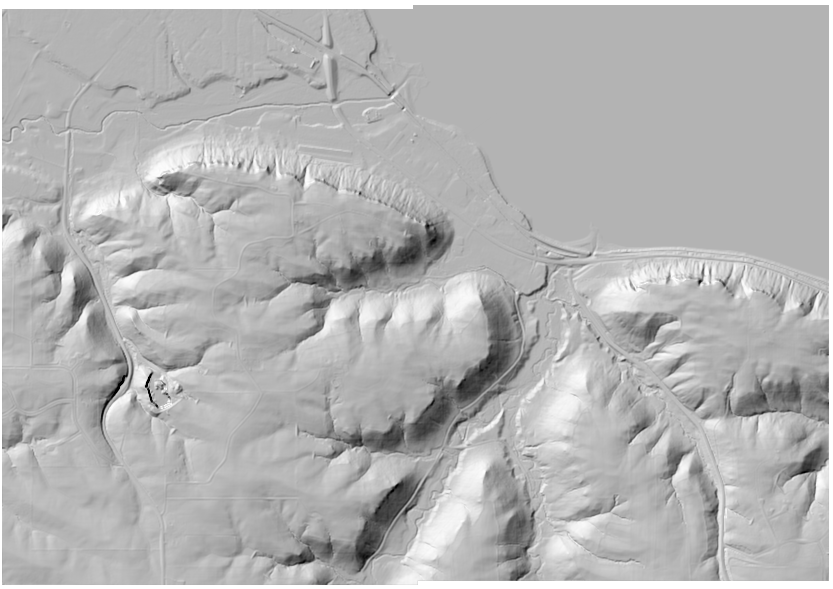
10. Overlay aerial imagery and other products
In addition to the mat that you’re making, Google and others have good mapping resources – including imagery. This can be useful when mapping as well.
It is possible to view these in QGIS at the same time as your own maps and data files!
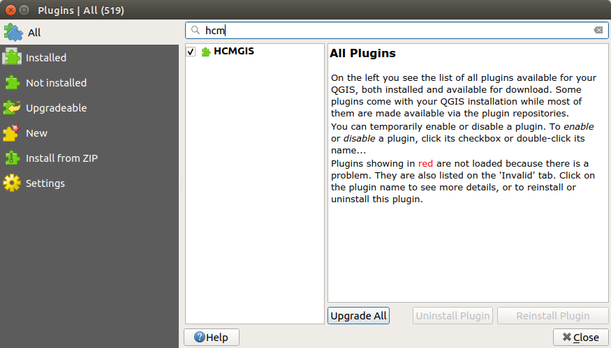
Click Plugins → Manage and Install Plugins Type “HCM” in the search bar. Install HCMGIS
Next, click HCMGIS → BaseMap → Google Satellite to create a satellite-map layer atop yours.
To see how the satellite photo intersects your topography, try the following:
- Uncheck “DEM” to hide it
- Double-click on the Google Maps layer and change its opacity (“Transparency” tab) to a moderately low value, maybe 30–50%. This will show you how the lakes, forests, and farms intersect the hills and low points of the topography.
- With this overlay on, you can click on and off of the “DEM” layer to see how this intersects the lakes, etc. It will not be a pretty picture – color mish-mash instead! But it will be informative to toggle between the two and look at what you notice.
Using the print layout, create a figure containing this semi-transparent imagery overaying the shaded-relief basemap, along with a scale bar.
11. Process Domains
Now that you have had a chance to explore some different ways of using QGIS to visualize data and create maps, it’s time to think about geomorphology.
- Zoom into a small area of the map, which encompasses both hillslope and channels. An example of a representative area with some varied terrain for you to think about lies below; note that I created a true shaded-relief map using the “raster” menu in order to build this map.
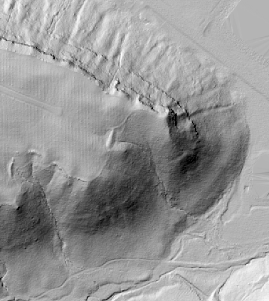
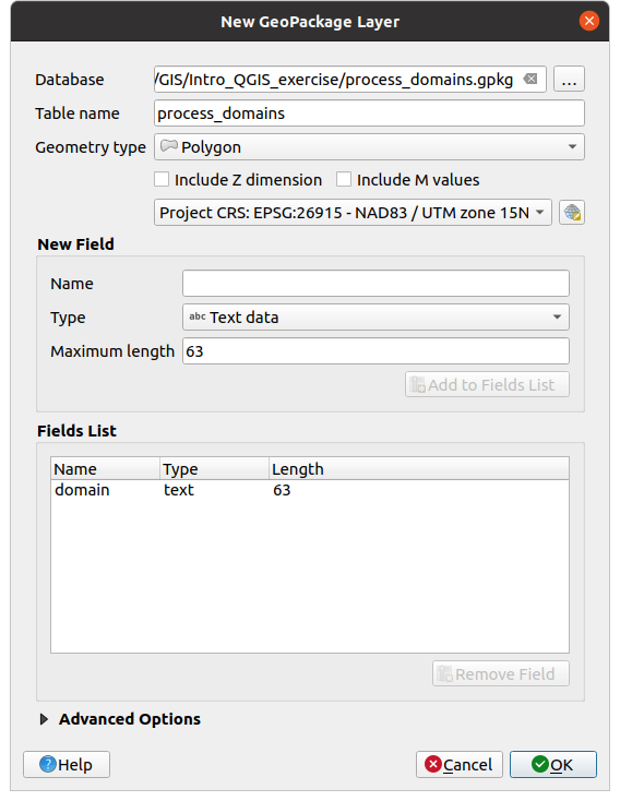
- Create a new GeoPackage (gpkg) layer following the example below; note the field called “domain”. This is a vector layer, made up of edges and vertices. Specifically, it is a polygon layer, which means that it encompasses an area. The other maps, on the other hand, are raster data sets.
- Classify the land surface into regions that you think may be dominated my channel (also called fluvial) or hillslope processes. Use your text-label field to indicate which one is which. To perform your classification, it may be helpful to build other maps, such as those showing slope or flow accumulation. Feel free to play around with QGIS and its features! The main idea here though is that you have a first idea of what these different zones are. It might not be quite so easy to pick out! That’s okay: spend more time thinking than you spend clicking (the idea is for good – not perfect – polygons, and that you learn.
- Next, prepare a map of your polygons as a semi-transparent layer over the hillshade. You will want to use the “categorized” option under “symbology” to make them show up as distinct colors. You may add additional maps to your report as well if you think that they are supportive of your work.
- Finally, write a justification for how you chose your different process domains. Describe the criteria and data that you used and how you addressed ambiguities. Because of the methods used, this may well be qualitative, and that is okay. Quantification in geomorphology comes after building a basic intuition for the landscape. There is no set number of words or paragraphs, but it must be necessary to present and defend your choices, and link them to the features that you are observing in the landscape.
12. Soils
A key component of soils and geomorphology is the relationship between erosion (or deposition) and soil production. Pick three points in the subset of the map where you analyzed process domains, and describe whether you think the soils will be thick or thin, and how that relates to the processes occurring (and their rates). As this is an exploratory assignment, your answers need not be right to be graded highly, but if they are wrong without an explanation, your grade will be poor! Make sure to provide reasoning behind all of your point placements.
Be sure to submit a copy of your map with labeled points in your write-up. You learned how to create GeoPackages above, and this could be a great way to work with this as well. In Layer Properties, QGIS allows you to set labels on your points, which could also be helpful.

This work is licensed under a Creative Commons Attribution-ShareAlike 4.0 International License.